

Hay
Making hay whilst the sun shines

Making
Hay
Designing seamless user experiences to help launch Australia's travel-focused neo-bank
As an early entrant in the Australian neo-bank market, Hay set out to compete with established European counterparts in early 2020. I joined the team in 2019 to help bring this innovative product to market. My role was pivotal in shaping and maintaining the product's core UI while also conducting research and delivering design solutions for new features, "Split Bills" and "Cashback Referral."

My contributions were instrumental in ensuring a seamless customer experience, positioning Hay for success in this emerging market. Neo-banks offer a unique and comprehensive product suite that differentiates them from traditional banks. At Hay, over 400 screens spanned complex and overlapping user journeys. As a key contributor, I played a crucial role in user research, new feature designs and QA maintaining UX and UI quality control during development.

Split Bills Feature
The Split Bills feature enabled Hay customers to request and manage bill splits among friends. My objective was to identify and resolve pain points in organizing shared payments, ensuring an intuitive experience that minimized user frustration.
Given competing priorities and limited UX research resources, I took the initiative to conduct informal research—engaging with friends, family, and even strangers—to gather insights. Despite constraints, I uncovered valuable findings that informed a highly effective design solution.

Research
I conducted six qualitative user interviews and a quantitative survey with 30 participants, identifying two primary pain points:
• Users found it frustrating to chase unpaid balances from others in the group.
• Some users (Person A) covered a larger portion of the bill than others (Person B), leading to awkward situations where Person B hesitated to request a fair adjustment.
Design
I developed a prototype incorporating key pain point solutions and refined it through user testing before moving into high-fidelity designs. The final process included:
• Person A selects a completed transaction (e.g., a group dinner payment) and chooses "Split Bill."
• The auto-toggle feature allows Person A to manually input amounts or use an automatic split function that adjusts as more participants are added.
• Adjustments for individual spending are dynamically updated in real time.
• The split request is sent to selected contacts for payment.
Comprehensive user journey flows were designed to ensure seamless functionality and technical feasibility, including:
• App and device notifications for real-time transaction updates.
• Status visibility for payments (paid, pending, declined).
• An option for declined participants to suggest an alternative contribution.
By addressing real pain points, this feature streamlined the bill-splitting experience, making it more intuitive and user-friendly.
Cashback Referrals
I also worked on a high-impact business feature allowing customers to invite friends in exchange for cash-back on international transactions. Users earned 0.10% cashback per referred friend, up to a maximum of 10 friends, totaling 1.0% cashback on every international transaction.
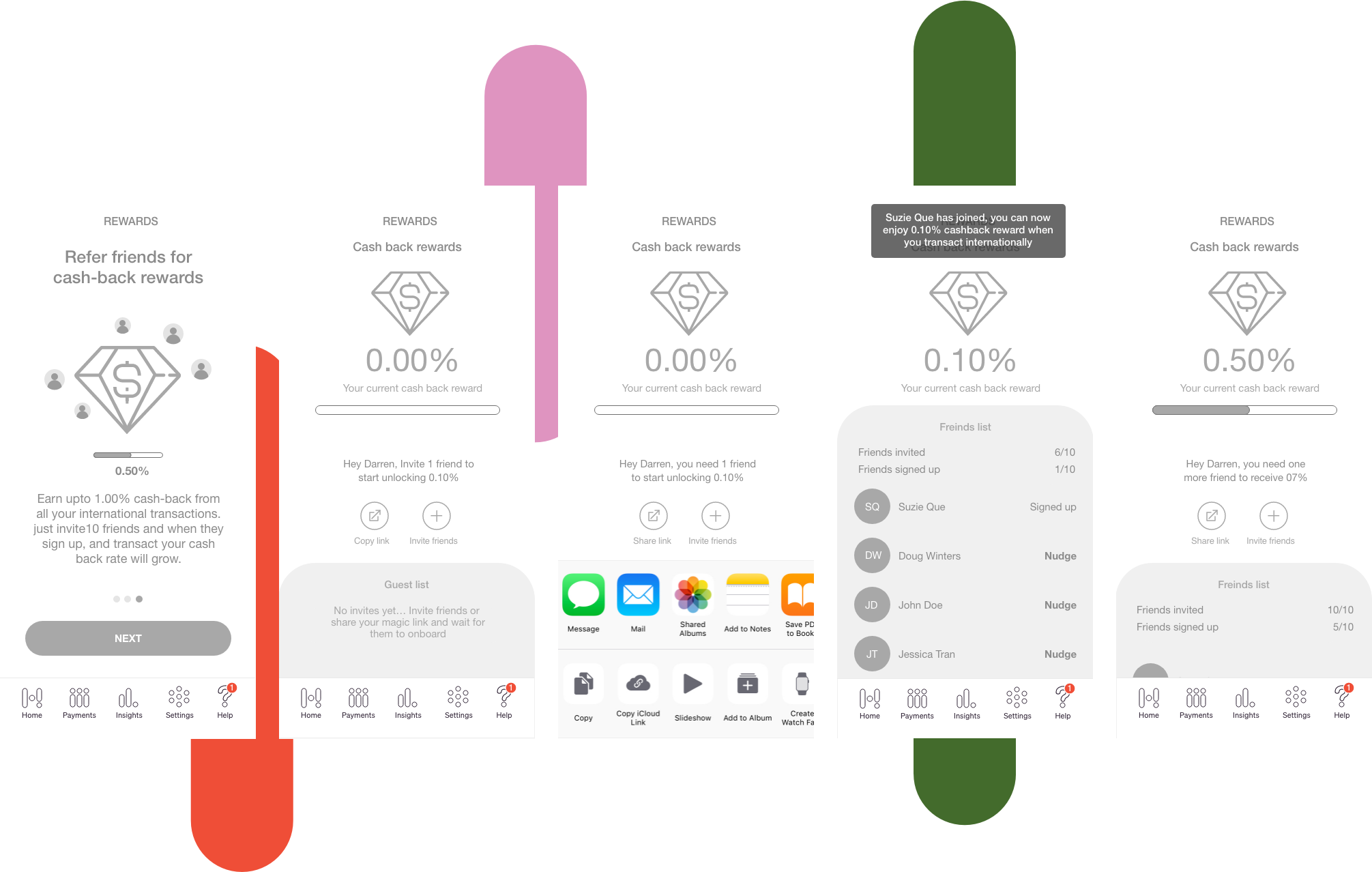
While the reward mechanics were predefined, my role was to ideate and design a simple yet engaging landing page to drive user participation. To achieve this, I conducted user testing on initial wirefames.
The focus was on:
⭐ Setting clear user expectations for the feature.
🔗 Enabling manual sharing of a unique referral link.
🎁 Displaying a benefits screen highlighting rewards.
🎮 Incorporating visual elements, gamification, and easter eggs.
📊 Adding a referral counter tracking invited and signed-up users.🔔 Providing a nudge feature for inactive invites.
Following the initial prototype, I conducted six user tests, achieving a 75% success rate. Iterative refinements based on feedback significantly improved the experience, ultimately exceeding user expectations. The final design simplified the referral process, enhancing both usability and engagement.